Brief a Film Poster Designer Without Asking for a Bigger Deck Cover
Brief a Film Poster Designer Without Asking for a Bigger Deck Cover
Give a poster designer the film’s public promise, the material needed to understand it, the facts that must remain accurate, and the places the image will appear. Do not make an existing deck cover the answer before the design work begins.
A deck cover can leave a question for the next page. A poster may be encountered alone. The difference is not simply size or polish: it is how much explanation the image can depend on.
Your brief should therefore make two things clear. What curiosity should this image create? What film would it be misleading to suggest? Those questions give the designer room to invent while giving you a basis for judging the invention.
Look at the cover without its supporting pages
For an original fictional example, consider The Work We Leave: two estranged sisters repair their late mother’s wooden boat before deciding whether to sell it. One wants to remove the evidence of old repairs; the other wants to keep it. Their shared work becomes a way to argue about what remains of their family. This is an intimate drama with dry humor, largely set in a boat shed. It contains no storm voyage or survival ordeal.
Imagine its pitch deck opens on an empty harbor at dawn. A small title sits above the water. The following pages introduce the sisters, explain the repair, and establish the tone.
The cover could be entirely appropriate within that sequence. Removed from the deck, however, it supplies a place and a mood while leaving the central relationship absent. It might suggest solitude, a travel film, or a story about the sea. These are possible readings, not measured audience responses. They identify information the deck was supplying elsewhere.
That does not mean the poster must explain the plot. It means the brief must decide what the standalone image should carry. “Use the harbor photograph, but make it more cinematic” avoids that decision.
Try this instead:
The image should suggest two people whose attachment to the same object brings them into conflict. The scale is domestic and physical. The boat is something they work on together, not an escape vehicle or a threat from the sea.
Now the designer has a relationship to explore. A harbor, two faces, a damaged object, or a more abstract proposition might serve it. The brief has not confused one available photograph with the only possible idea.
Write a promise that can distinguish concepts
“Beautiful, emotional, bold, cinematic” does not tell you why one proposal fits better than another. All four adjectives could describe both an intimate family drama and a disaster movie.
For this film, the useful promise is narrower: a shared repair exposes a relationship that is harder to repair. The image can be quiet or confrontational, literal or oblique, but it should make the shared object or the tension around it worth noticing.
The negative boundary matters too. Do not imply a perilous voyage, a spectacular wreck, or a broad nautical comedy. These are not bans on weather, boats, or humor. They are checks against inviting a viewer to a different experience from the one the film offers.
A designer’s published account can show how a specific relationship becomes an image without supplying a formula to copy. In Version Industries’ case study for Joyland, the studio describes presenting several directions, then developing a selected idea through hand-drawn courtyard tiles with openings revealing the central characters. The account connects a material detail from the film’s world to the relationship the poster suggests.[^joyland] That is a design decision grounded in that film, not an instruction to put your characters behind decorative tiles.
Give references the same specificity. Explain whether a reference helps discuss scale, separation, texture, or the relationship between title and image. An unexplained collection of admired posters leaves the designer to guess which qualities you intend—and whether you expect imitation.
Separate fixed facts from exploratory material
The brief should distinguish information that must be preserved from material offered to provoke possibilities.
For a real film, provide the film itself or the appropriate authorized viewing material, an approved synopsis, and an honest account of what is still changing. Label the material’s version. Identify the confirmed title and the person responsible for approving credits, release information, endorsements, or other factual additions. Do not ask the designer to infer those facts from an older deck.
Keep the asset information just as explicit. An image might be available for internal discussion without being cleared for a public campaign. A useful contact sheet can identify the file, what it depicts, and whether it is reference-only, awaiting clearance, or approved for the stated use. The responsible rights owner or adviser needs to confirm that status; the brief is not a rights opinion.
The practical consequence is simple: the designer can explore a direction using an asset without mistaking that exploration for permission to release it. Conversely, a cleared production still should not become mandatory merely because it is convenient. Its usefulness remains a design question.
Discuss the scope of development and the work being commissioned. Agree which concept routes, revisions, adaptations, and final files are included, with compensation and approval responsibilities clear before asking for the work. “Show us some ideas” should not conceal an indefinite unpaid competition.
Sundance Institute’s account of the Columbus release describes a distinct collaboration on promotional assets, with Intermission developing poster and trailer ideas in conversation with the filmmakers.[^columbus] That historical account supports treating the poster as development work within a release campaign. It does not establish how many concepts every designer should provide or prove that a particular poster caused ticket sales.
Compare two promises, not two color schemes
For The Work We Leave, consider these original directions:
Direction A: the shared repair. Two hands approach the same worn patch in the boat’s hull. One holds it in place. The other advances a scraper toward it. The old repair sits between the gestures. The concept asks what each person is trying to preserve or remove.
Direction B: the storm. A small vessel sits beneath dark clouds and oversized waves. The title remains the same, but the dominant relationship is a vulnerable boat against an overpowering environment.
Both use a boat. That shared noun does not make them equivalent. A proposes conflict between people through an object. B proposes danger from the surrounding world.
The following schematic mockups were made for this article. They are original layout studies, not finished illustration, actual campaign assets, or borrowed film posters. Both use a restrained grayscale treatment so that the discussion can focus on their central relationships.
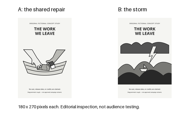
The larger repair study and larger storm study are also included. The mockups make the distinction visible, but they do not settle every reading question.
In A, the two gestures and the shared work survive reduction. The small patch and the scraper’s action are less explicit. Someone could read cooperation rather than disagreement. That is a real issue for the next design pass: the conflict must become clearer without turning the film into an exaggerated feud.
B communicates environmental danger more directly. For the invented film, that clarity is not an advantage. It clarifies the wrong promise. Changing the typeface or reducing the contrast would not remove the storm narrative. The concept, not merely its treatment, needs to change.
This distinction keeps critique useful. A promising idea with a weak focal relationship needs development. A polished idea that invites the wrong film needs reconsideration. Treating both as requests for “more impact” obscures the difference.
Check the contexts you actually intend to use
The studies were exported at 1080 × 1620 pixels and reduced to 180 × 270 pixels. Those are review sizes chosen for this exercise, not printer specifications or a platform’s requirements. Inspecting the smaller exports revealed the ambiguity in A’s action; it did not establish how a real audience would interpret the poster.
An automatic square crop exposed another problem: it cut the title. The repair concept’s central square crop retains the hands but loses the first line of the film’s name. The composition needs an adaptation, not a promise that every placement can use the same file.
Use actual placement information in a commission. A lobby poster, a festival listing, and a small digital card may have different crops, neighboring text, and reading distances. Obtain the requirements from the relevant delivery owner rather than treating a familiar aspect ratio as universal. Ask which versions need to be designed, not just exported.
There is a limit to what an on-screen reduction can tell you. It can reveal that type disappears or a gesture merges into its background. It does not replace a physical print proof, verify a particular display, or show whether strangers understand the film’s tone. Keep those checks separate. If you ask people for responses, report what they actually say rather than translating agreement with your explanation into unaided comprehension.
For a brief, the important outcome is a named design problem at a named use: “At the small listing size, the second hand reads as helping rather than resisting” is actionable. “It doesn’t pop” is not yet a diagnosis.
A usable brief for the fictional film
The following brief consolidates the decisions without dictating finished artwork. Its production facts are fictional assumptions for the exercise, not an announcement of a real film or commission.
Project and purpose
Develop a standalone public-facing poster concept for The Work We Leave, an intimate drama about two estranged sisters repairing their late mother’s boat before deciding whether to sell it. The image must work without the pitch deck’s explanatory pages.
Public promise
Two people are attached to the same object for different reasons. Their disagreement emerges through ordinary physical work. The image should invite curiosity about the relationship, with room for dry humor and affection.
What not to promise
This is not a sea voyage, disaster film, survival thriller, or broad nautical comedy. The boat is the site of the relationship, not a spectacle.
Material and factual boundaries
The title and premise above are fixed for the exercise. No cast, credits, release date, laurels, quotations, or endorsement claims are supplied. Do not invent them for the roughs. The accompanying schematic studies are original exploratory material, not an instruction to reproduce their illustration style.
Contexts and formats
For the exercise, assume three intended uses: a festival listing thumbnail, a lobby poster, and a small digital card for program and social listings. These are the named targets for the large and small readings below. Treat both small placements—the listing thumbnail and the digital card—as square-ish, so that each calls for its own composed square adaptation rather than a reduced copy of the lobby file. Exact dimensions, bleed, type minimums, neighboring text, and any further placements come from the relevant delivery owner; the designer should receive them rather than improvise them.
Directions to discuss
Develop the relationship around the repair: preserving and removing the same patch. Another concept may use a different visual idea, provided it carries the shared attachment and disagreement. The storm study is a rejected example of a false promise, not a competing style preference.
Review and adaptation
At concept review, compare the central visual relationship before cosmetic variations. Examine the concept at the lobby size, then each small square adaptation—the listing thumbnail and the small digital card—as its own composition rather than a crop. The example’s pixel dimensions are only review formats; delivery specifications for each named use must be supplied for final production.
Next decision
Can the repair direction communicate a disagreement without losing tenderness? Identify the revision and any additional original or cleared imagery needed before final artwork is commissioned.
A live brief would replace the exercise’s material assumptions with real viewing access, approved facts, asset status, delivery requirements, and an agreed commercial scope. The designer should receive those as information, not as an invitation to guess.
The useful feedback on A is not “make it look more like the deck.” It is: clarify the difference between the hands’ intentions, preserve their connection to the same object, and recompose the title for the small square adaptations. The useful decision on B is to stop developing a storm the film never contains.
Your deck cover may remain exactly as it is. The poster now has its own job.
Sources
[^joyland]: Version Industries, “Joyland — film poster”, “How.” Designer-authored account of the selected direction and its construction; inspected September 19, 2026. Used for the stated design process, not as a public copy of the approved brief, a rights clearance, or an effectiveness study. No artwork from that case is reproduced here.
[^columbus]: Jess Fuselier, Sundance Institute, “Distribution Case Study: Columbus”, “Implementation” → “Promotional Assets.” Historical campaign account with producer testimony; inspected September 19, 2026. Its campaign outcomes are not attributed to the poster in this article.
Frequently asked questions
Why can't a film poster just be a larger version of the deck cover?
A deck cover can leave a question for the next page; a poster may be encountered alone. The difference is how much explanation the image can depend on. In the invented example, an empty harbor at dawn supplies a place and a mood, but removed from the deck it leaves the sisters and the repair absent, so it might suggest solitude, a travel film, or a story about the sea. Those are possible readings, not measured audience responses.
What should a poster brief say about the film's promise?
State a useful promise narrow enough to distinguish concepts, such as a shared repair exposes a relationship that is harder to repair. State the negative boundary too: do not imply a perilous voyage, a spectacular wreck, or a broad nautical comedy. Those are checks against inviting a different experience, not bans on weather, boats, or humor. Generic adjectives like beautiful, emotional, bold, and cinematic do not tell you why one proposal fits better than another.
How should references and materials be handled in the brief?
Explain what each reference helps discuss, whether scale, separation, texture, or the relationship between title and image; an unexplained collection leaves the designer guessing and possibly imitating. Separate fixed facts from exploratory material: for a real film, provide authorized viewing or the film, an approved synopsis, the confirmed title, and the person responsible for approving credits, release information, or endorsements. For assets, identify the file, what it depicts, and whether it is reference-only, awaiting clearance, or approved; the rights owner or adviser confirms that status, and the brief is not a rights opinion.
What is wrong with the storm direction for The Work We Leave?
The storm direction proposes danger from the surrounding world, while the repair direction proposes conflict between people through a shared object. The storm communicates environmental danger more directly, but for this invented film that clarity is not an advantage; it clarifies the wrong promise. Changing the typeface or reducing contrast would not remove the storm narrative, so the concept, not merely its treatment, needs to change. The repair direction has its own real issue: it could be read as cooperation rather than disagreement, and the small patch and scraper are less explicit, so the conflict needs clarifying without turning the film into an exaggerated feud.
What should I check across the contexts where the poster will appear?
Use actual placement information. A lobby poster, a festival listing, and a small digital card may have different crops, neighboring text, and reading distances; obtain requirements from the relevant delivery owner rather than treating a familiar aspect ratio as universal. The example treats both small placements as square-ish, so each calls for its own composed square adaptation rather than a reduced copy of the lobby file. The 1080 by 1620 studies reduced to 180 by 270 revealed ambiguity in A's action, and an automatic square crop cut the title. An on-screen reduction can show that type disappears or a gesture merges, but it does not replace a physical print proof, verify a display, or show whether strangers understand the film's tone; if people are asked, report what they actually say.